Friday, December 12, 2008
Review: Hatpire...
When I think of vampires, I tend to go with Dracula, Anne Rice books, goths, and heck, even the Blade movies. Well, now we have a new vamp on the block, and this one is a big fan of tophats. So big, in fact, that he's named after them. Hatpire, created by one Becky Turpin, follows the oddball life of the title character as he does all sorts of cutesy stuff. This one updates three times a week, to fulfill all of your vampire needs. Onward!
Hatpire is the Hello Kitty of vampire comics. Why do I say that? Because it's squishy Chibi-ish characters and really bright colors remind me of what a day in Japan must be like. Everyone walking around throwing peace signs and winking at each other. Nevermind that. A very cute and simple art style that would fit in perfectly mashed between Pokemon and Spongebob.
I can't really tear apart the writing and pick out anything that bothers me other than that there is pretty much no dialogue. Lots of symbols and exclamation points are used to convey emotions or actions, and while it's cute, it makes for a really simple comic. I take it that's what Becky is going for, but after a while it might get tough to figure out how to keep things going without words. Just sayin'. Apart from that, Hatpire himself sure is nice. I mean, he has to be the nicest vampire ever, because he doesn't suck blood(maybe offscreen?), and at one point he finds a coin, only to give it back to the guy who lost it. How kind. How un-vamp like. But, this is a truly different take on bloodsuckers, so don't come in here looking for a way to bring your goth side out. You're more likely to put on a pink sweater and hug someone.
Hatpire is a comic for fans of light hearted fluff, and while it's not my cup of green tea, it might be yours. It's cute family fun, and perfect for young girls looking for the next Care Bears, or whatever else is in with them these days. Sink your teeth(heh) into Hatpire and decide for yourself.
I give Hatpire...
(For cute and colorful art, but too simple for my tastes)
Wednesday, December 10, 2008
Ahem....
Hey everyone. Now, before you bite my head off for being gone again, lemme just say things are tough in the Land of ole' Jack. I won't get into details, but I'll just hint by saying my interests have been lying in my family life and Christmasy stuff, and trying to fix things with my girlfriend of almost four years....okay, so that was a bit more than a hint. Anyway, I didn't mean to stay away so long, but things are what they are. I just put up a new poll, and you can also marvel at my awesome photoshopped new Christmas themed logo for the site. Drop me a line if you need some photoshop tutorials, as I'm always just an email away. And yes, I'm totally kidding about my photoshop skills. I pretty much suck. Okay, you may be wondering when you're going to get a new review. Well, let me just say that tomorrow, God willing, and if things don't continue to go even more sour than sucking on a lollipop that looks like Carrot Top(my arch-nemesis), there will be a review up, in the evening. But don't hold me to that, because my life has a tendency to get kicked in the balls repeatedly. Okay, with all that said, let me take a second to thank all of those that are still checking out the site. Later!-Jack
Sunday, October 19, 2008
Hey, take a look!
Sorry about the lack of updates last week, but I've been working on my new comic site, Gothy! You probably don't know, but I used to do a comic called Gothy Mcgee(then changed the name to Tilly)but Comic Genesis crashed and I gave up on it. I had a substantial archive, and I've still been drawing the comic since then, but had no site to put them on, until now. I'm going back and pulling out the best ones from the old site and putting them on the new one as well. I'll probably color them all eventually too. So, go on over and check it out and let me know what you think. It's just a silly little three panel strip, but I hope you like it. Later!
Friday, October 3, 2008
I hope this never happens again...
After reading the comments about my Power Up Comics review, I did a little digging, and boy, do I feel like a dumbass. I did note that this comic couldn't possibly be this bad and be serious, but now I know the truth. Click to see what I'm referring to. From now on I'm going to make sure a comic is real and deserving of a review before doing so. But that's not going to stop me from reviewing bad comics. I will say this though. They sure as hell did what they set out to do!
Thursday, October 2, 2008
Oops!
I was going through my archives and noticed that I missed putting up in the "links to comic reviews" section about ten links to comic reviews! I don't know how I could have made that big of a flub, but anyway, it's fixed now, and if you've never gone through the older posts, you can now see ten reviews you probably didn't even know were on here! Sorry bout that!
Review: Power Up Comics...
I know some webcomic reviewers say things to the effect that they will only review comics that they can give a meaty, lengthy wall o' text of, or comics that they like right from the beginning, or won't even give a gag strip a second look. If you're going to review, I would think that you should take a look at any and all types of strips, good and bad, otherwise you're biased, and you should probably be doing something else. I don't think Siskel and Ebert(or Ebert and Roeper)skipped movies just because they didn't like comedies, or knew ahead of time that Fly Me To The Moon was a pile of chimp nuggets. Of course, you could also say that this is just a hobby and you just want to say what you want about whatever you want, so hey, I suppose that's okay too. Anyway, this is all going someplace, if you thought I was just rambling like Quentin Tarantino talking about crappy blaxploitation cinema from the seventies. Review? Okay, okay, here it is...
Power Up Comics is a(shudder)webcomic about..wait for it...gamers on a couch! Yeah, I know. Wait a minute though, could it have some originality? Well, let's not get ahead of ourselves here. The comic revolves around a couple of shmoes with names like Turdburger and..oh, no, that's not right...okay, Dorkwinkle *cough* and Shadow(cool huh)talking games and game systems, and even talking TO the game systems themselves. Shadow and Chug(the creators of this opus)have given us a traditional gamer comic to gander at. Should we gander at it? Oh man...keep reading..
I'm just going to go ahead and get it right out. Good Lord the art is atrocious. The character designs themselves aren't so bad, except that they use the SAME DRAWINGS IN EVERY SINGLE STRIP! What the hell? Here are a couple of examples: This one, and this one. Or hey, how about this one, and this one. I could go on and on and on....I have NEVER seen this amount of reuse in a comic. It's almost as if it's being done with a purpose other than being lazy or having no artistic skills. Maybe he's just out to make a horrible experience? I don't know, but at any rate, it's bad, the art is just flipped around at different angles at times, cut and pasted to oblivion, and the colors are of the blindingly bright variety, but the same art over and over. Look at this one! It's just Dorkwinkle with long hair! Disgusting.
Story and writing! Wheee! Okay, the characters go on wacky adventures, such as ending up at the Hardon Hotel to have sex with an obese woman, or, well, that's about it. Other than that it's just sitting or standing around the couch saying things like "you're gay" or "you're really gay". Terrible jokes, or no jokes at all, infect you like a bad case of gout or something. I can't find anything positive because it's just not funny. They don't even make funny or interesting observations about games, the whole POINT of this comic. AAAAAGH!!!
Okay, let's just end this disaster right now. I actually found it more fun reading the reader comments making fun of the comic than the comic itself. But I found that there were regulars that came to the comic. Why? Maybe I have an answer to that. I read the entire archive. Because it was so bad that I found myself laughing at this abortion. But not because it was good, no no. This has to be the worst webcomic I've ever seen. It was kind of like a car wreck. Couldn't look away. What does that say about me? I think I need therapy after this. I'm going to go cover up in my bed and cry myself to sleep after this one. Avoid it unless you're the kind of person that would watch Faces of Death. If that's the case enjoy! How was that for a review?
I give Power Up Comics...this video.
The Webcomic Beacon!
I'll be the first to admit I've never listened to a podcast before today. Ahem. I'm a little bit embarrassed about that actually. BUT, after listening to The Webcomic Beacon #43-Placing Ad Space, I'm sold on the idea that this is a GOOD THING. I recommend you go on over and browse through all 43 topics(which is a large number of podcasts for the time the site has been up), and I'm sure you'll find one that will help you in whatever problem you may be having, or you can just enjoy the back and forth between the hosts, Fes, Tanya, and Aaron. They even mention me! I've GOT to get back to them about being on the show....Click the link!
Tuesday, September 30, 2008
Review: AT-43...
Tracy Constantine has decided to grace us with a second comic now that A Gunfighters Life is done, and came up with AT-43. What is AT-43? A comic based on a table top miniature strategy game I've never heard of. But I'm no role player, so of course I wouldn't know what it is. I'm going to have to review this as an outsider to the AT-43 world. So how good is this webcomic? Let's dive right in...
Right from the start I can tell the style of Tracy from A Gunfighters Life. And I'm sad to say that it hasn't changed at all. What I mean by that is the same problems I had with the other comic I see here as well. It's nice and brightly and professionally colored, cleanly drawn and in a decent style, but lifeless. The characters almost always have their hands at their sides, just standing around with this bored look on their faces. If you were at some kind of war, wouldn't you be prepared to fight, eyes wide open and ready to fire at a moments notice? I know I would. These guys just seem ready to take a nap. And on the rare occasion that they do fire, it's so stilted that I think my grandma Bessy could take out an entire army before they pull a weapon! Oh, and the backgrounds are usually just black or a dark shade of blue or something to fill space. War. Dilapidated buildings. Shrubs to take cover behind. Cars on fire. Or whatever they drive or fly. That's just what I picture when thinking about war. Don't get me wrong, I like the style, just not some the flaws I mentioned.
There really isn't a story to be told here, as it's based on a strategy game. If you want to know what's going on you have to read about the world of AT-43 on his website, which I didn't want to, because I'm about webcomics, not role playing in somebodies basement(Don't hit me!). So, I'll talk about the jokes. Basically what we have here is a failure to communicate. With the average webcomic reader. If you're a player of this game I have no doubt you'll enjoy the injokes, but I found it very "inside". I get that it's a war game, and I should be able to enjoy for that, but I just didn't. I didn't find it that funny, although I have always had a soft spot for jokes that involve characters thinking that they are safe only to show the bad guy standing right behind them. The problem with that one is that it's used to death in this comic. I saw it over and over. Once with a missile, and about three or four times with the bad guys. Without setting up the comic with some backstory(because most people aren't going to want to read the "about" stuff), the jokes just aren't going to register as well. Maybe an issue 0 or a prologue can be added. Give us some meat so we'll be able to enjoy it as a stand-alone story or it's going to appeal only to players of the game.
AT-43 is an okay webcomic, and does stand atop a pretty large pile of worse comics, but needs a lot of work to gain some sort of following outside of the game. It basically needs a sense of self. Get us some backstory and characterization and maybe this one will have legs. As it is I'm not going to be following Tracy's newest offering. Perhaps I'll check it out again in a couple of months to see if any tweaking has been done....
I give AT-43..
Friday, September 26, 2008
Need help with your writing?
Look no further than the Marooned webcomic site for a lengthy article entitled "7 Keys to Writing for Webcomics". You'll find good info which could give you a leg-up if you're having some trouble. Go on over and give it a read!
Thursday, September 25, 2008
New Widget! No, not that Ewok from Return of the Jedi...
Old joke? Probably. Anyway, I've added an outbrain five star rating system so you can now let me know what you think of new posts with a simple click. I value your opinions, so click away!
Tuesday, September 23, 2008
Interview, The Sequel: Nick Perkins of Cooties!
Ever wonder what's going on months later with someone that's already been interviewed? Well, I was, so I decided to check in on Cooties creator Nick Perkins to see where his head is at these days. I provided the questions, he provided the answers. Take it away, me!
1. You've been plugging away at Cooties for a long time now. Is it where you wanted it to be at this point, and define success for us, at least in your eyes.
Unfortunately, after two years I am still in the midst of my first storyline; however, the light at the end of the tunnel is getting brighter. I've got so many other (and shorter) stories I plan on telling with this comic, and I'm finally at a point in my quality and productivity with the comic that I have just started beginning to advertise. I am having a blast with this point in the story (the lunchroom brawl was so dang fun to draw!).
As for success, for me it can be defined in two ways. My greatest hope is eventually having someone at Dreamworks or some such entity pick it up for a computer-animated movie or Saturday-morning series. Hey, if you're gonna dream, dream big, right? At this point, though, success for me is keeping my readership growing and my quality increasing, which I have and am still accomplishing.
2. I see you've recently moved your domain to Spiderforest. How has that transition been for you?
The move to Spiderforest has been better than I'd hoped. I'm grateful to ComicGenesis and my time there, but there is a stigma in the webcomics world attached to having a CG domain. I think it's highly undeserved, myself, but to each his own. The main reason I left CG was the opportunity to be part of a more tightly-knit community and the chance to get a little more exposure. The people at SF were extremely welcoming, and helpful with getting my new site set up, and with ComicPress to boot! It's great to have Cooties surrounded by so many quality webcomics.
Having an all-ages comic, I was a little worried about being in a community with some that were definitely not; looking at it realistically, though, that problem was magnified a hundredfold being a CG comic anyway, so I made the leap. As of yet, I have had no reason to regret it (especially since my readership has doubled since I first went to SF!)
3. I see you've gone for more of a dynamic, full page comic book style for Cooties. Do you plan on staying with this style or eventually trying something different?
I really like the current format. I like having the comic fill up the whole screen. I'd like to keep it that way through the end of my first storyline. After the first storyline is done, I may do gag-a-day newspaper style strips for a while; at the same time writing, drawing, and coloring the next big storyline. When that's all done, I'll run that story five days a week for its whole duration. Having a story drag itself out over 2-3 years will be a thing of the past, hopefully. I think I've reached a point in my productivity where that will be doable. My readers will definitely like it.
4. So the political race is heating up faster than my grandmas flapjack griddle. Have you ever considered adding some jokes taking jabs at Obama or McCain?
I'm an editorial cartoonist for my local newspaper, so this election is definitely catching my attention. Having said that, I don't want to interrupt Cooties' story flow right now; and this seems to be a perfect question in which to shamelessly promote my brand new strip, Dadmocracy. I needed an outlet in which to use all those comic strip ideas that I couldn't put into Cooties, so the new strip was born. I've made a strip involving Governor Palin, and you should see Obama & McCain show up within the next few weeks.
5. Do you have any webcomic recommendations for the readers?
I actively follow between 40-50 different webcomics. Some of my favorites that not everyone may have heard of:
Ardra
One Small Step
Imy
Union of Heroes (found by reading Webcomic Asylum, natch!)
and my fellow SF-er, Avernyght!
6. Let's just imagine you have 60 seconds to promote your sites in front of a crowd of a million people. Go!
Cooties - Nate, Jake, Carmen, Lori and Sam - a group of ordinary kids dealing with school, friends, parents, government agents and an alien invasion. One of them unknowingly holds the key to Earth's fate, but he'll need all of his friends' help to save humanity from mind-controlling conquerers...
Dadmocracy - A weekly semi-autobiographical comic dealing with fatherhood, politics, media, and other assorted chuckle-inducing shenanigans!
El Cartoonista - my blog features a new comic each weekday, from classic strips to current Cooties & Dadmocracy comics to blog-exclusive goodness. Your one-stop shop for all my scribblings.
That was great! Thanks to Nick for sharing his thoughts with us. Give Cooties a shot, and be sure to check out his other sites. Till next time....!
Sunday, September 21, 2008
Webcomic Therapy?
Hey everybody. Yknow, before webcomics I grew up longing to share my little sheets of paper folded in half with superheroes on em. I even went so far as to write and draw little subscription boxes on the back asking for money for 12 weekly issues. Lame? Yes. But I was a kid. Then when I got older I attempted the ole self publishing debacle. For me it was a debacle anyway. To break even I would have had to charge about five bucks for each issue of my comic, simply titled Superheroes. I charged fifty cents and put em in a couple of comic shops, just to see what it felt like. Then came the interweb. I LOVED it. I started out with Gothy Mcgee(which I plan on starting up again soon), and went on to do a few others, this site included. It gave me a way to express myself, and pretty much do it for free. I was able to give my point of view on a variety of topics, ranging from obesity to Indiana Jones. My point being I was able to escape reality whenever I wanted to. So, what say YOU about webcomics? Where would you be today without em? What have they done for you, good or bad? Gained any relationships? Lost any? Made money? Lost any? Overcome an addiction by making THIS your addiction? Anything you would like to share would be appreciated. I'm sure we would love to hear your stories. Make em known right here!
Tuesday, September 16, 2008
Review: Planet Karen..
A self described diary style comic, Planet Karen delves us into the mind of Karen Ellis and her life in pictures as a goth-garbed girl full of self doubt and a slacker mindset. From her own admission, parody gives way to truth and a webcomic as a form of self release. Good to know a comic can serve as a Dr. Phil and not just guilty pleasure entertainment. On with the review, aye?
This is one of the more stylized comics with a "less is more" mentality, at least from the pile that I've reviewed. It sort of reminds me of this local comic I came across maybe 10 years ago called "Bitter Girl". That is to say very sketchy, almost an afterthought art, at least for the first half. Karen stands apart from everyone else with giant anime eyes and all black dress, the uniform of choice for the down and out. The hand written text was a bonus for me as I'm a believer in pen and paper(and perhaps because I do all my own text as well in my comics). She eventually goes for a cleaner, neater presentation, but loses none of it's style and charm. All is well on the artistic side of things. The writing, on the other hand..
Being essentially an illustrated diary, things can go either of two ways. One, you can be incredibly insightful in letting someone into your innermost workings, or two, you can look like an egotistical douchebag with an idealized version of yourself. Karen fits somewhere in the middle. Some strips are downright poetic, such as this nugget of personality. Others, however, are nothing more than a day of lying on the couch watching tv. While there is more than enough to keep you interested, as the comic is smartly written in most cases, it can sometimes be a bore. Oh, the egotistical side of things. Karen isn't(and she's no douchbag!), but she does draw herself as this skinny, cool, anti-establishment alternative chick when she admits down the line that she's overweight(and maybe doesn't even dress like that?). But I get the feeling that the intention is not to keep you entertained, but more to just plain express herself, and Karen does that admirably. Not everyone would be this open, especially with a webcomic that knocks her friends. Ever fear reprisal, Karen?
This comic has the potential to make you feel good knowing that there are people out there who go through the same sorts of everyday blahs that you do, and think the same types of not-so-feel-good ways of dealing with it. Or you'll get bored fast. I don't know which side you'll fall on, but I say give it a shot and see what happens.
I give Planet Karen...
Thursday, September 11, 2008
Become one of my minions!
So I just added a cool feature that lets you, the reader, add yourself as a follower of this site, just by clicking the link! I think it's pretty cool, and I would love to add you to my legion of fans...cough...so just look to the right and scroll down a wee bit and you'll see it. Please take a second or two to add yourself, and show some love for this feeble review site!
Coloring really takes a lot of time, doesn't it?
Hey everyone, just dropping in to let you know that the new Milton and Jen review is completed, well, at least the art. The coloring is going to take a while, and I'm starting to wonder why I put myself in this position! Man, juggling a family, work, AND a webcomic review site is taxing to say the least. I might just do the review in greyscale, but that might seem to be the lazy way out. I'm still trying to figure out a way to incorporate visuals with the review, but not make it such a pain to get them done quickly. Any suggestions on ways to make things easier? Oh, and one other thing. Remember the contest I ran a while back? Yeah, no one entered it. I couldn't believe that. Not one person could throw together a little ad for the contest? Man, that really knocked the wind out of my sails. But not to worry, I guess people aren't here to do that stuff, they are here to read reviews! Well, I'll let you know when the review will be up. Check out my Twitter to keep up to date! Oh, and I can AT LEAST show you a sneak peek of the new review. Later!
Thursday, August 28, 2008
Review: Union of Heroes...
Photo webcomics. I've reviewed a couple to date (one being okay, the other being vomit inducing), but haven't really had the urge to review another until this one came around. Union of Heroes is a new take on superheroes by Eric Wünsche and Arne Schulenberg, two guys from an area in Germany called Ruhr. The big shocker that got me intrigued was the fact that they actually got a bank to FINANCE this little ditty. What kind of sweet talking they did I have no idea, but here is the result. The basic rundown is this: Marc is called upon by a stuffy looking older gentleman, who shows up out of nowhere, to replace a parallel Earths version of himself, who just happens to be The Erzengel, a fallen superhero. Did you catch that? Okay. From there we follow his attempts to figure out his powers, and to discover the hero inside. Union of Heroes updates every Monday, Wednesday, and Friday.
It's always a little tricky to review the "art" of a photo webcomic, as it's not the traditional form that they take, but hey, photography is a great artform unto itself. Done right, the potential for great scenes and emotion is there. Is it here? The camera used takes some stunningly clear and brightly lit photography, and the backdrops are always nicely setup and almost movie quality. There is also a good variety to the camera positions as to not have a static feel to the panels. I enjoyed the photogenic actors, even though they did have cheesy looks on their faces once and a while. It must be difficult to convey the right emotions in a webcomic without coming across as looking goofy. Kudos to them on their acting abilities. You can tell that they are having fun with this.
Seeing as how this is a superhero comic, inevitably there will be special effects involved. I'm glad to say that the small amount used so far aren't as tacky as they could have been. The hand-melding-to-a-shelf effect looked decent enough, but what I'm waiting to see is a knock down, drag out superhero brawl. How will they pull that off? Can't wait to see....
With every good superhero comes a good origin story. Now, with The Erzengel already established as Marc from a parallel Earth who somehow died in the line of duty, we are left discovering his powers along with him. The power of being able to meld with metals and shape them to his will. To do other things not explored yet. How does he cope with what's going on around him? Strangely and a little bit unbelievably. The translation is somehow distorted from German to English, with lines like the one in the panel above, but it's not so bad that you can't read it and still enjoy the comic. By strangely coping, if you read the comic you'll see that Marc responds to a complete stranger being in his place by coming at him with a bat. Something you and I would do, right? But all this stranger has to do is offer him an omelette and he sits at the dinner table. What the heck? I would have caved that guys forehead in a second! Also later, after explaining that he is from a parallel Earth and that Marc is to become The Erzengel, the stranger asks him if he will go with him to this place. What does Marc do? Heck yeah he'll go! Wouldn't you if some crazy man showed up and offered to make you a hero on another world? Yeah, didn't think so. I just feel that more time should have been taken to show Marc at least CONSIDER that this dude could be a psycho homeless guy or something. Okay, the good. These guys are doing a decent job of setting up the comic, aside from a few pacing problems. I found myself anticipating seeing our hero go through the hiccups of attempting to be a superhero, which is yet to come. Marc is a likable guy who isn't without faults, and The One Who Knows reminds me of Giles from Buffy The Vampire Slayer. These two will make a good team, I can tell.
I do believe I'll be following this comic to see what becomes of The new Erzengel, and to see how they pull off all of the special effects required for a superhero webcomic. A decent webcomic, and the best photo one I've seen yet. It's a good story so far, and I can see this one building up to be a good action drama in the future. I'll bet if you give it a chance you'll at the least find it a guilty pleasure. Check this one out. It's not often you get to see a German superhero in the making.
I give Union of Heroes...
No Milton and Jen?
Hey all, just letting you know why the new review is in the old style and not the Milton and Jen Illustrated Review one. Well, here's why: drawing takes time! Heh. And coloring. And lettering. And I'm still trying to figure out how to present the illustrated reviews and make them interesting and not just a cheap gimmick. I still enjoy doing the regular written reviews though, which ARE more professional. I might keep doing it this way anyhoo. One illustrated, then one written. Anyway, enjoy the new review!-Jack
Monday, August 11, 2008
Milton and Jens Reviews: Stud Kickass!
Well, here we are with the very first illustrated review! Yep, this is the new approach I wanted to try. So please, give these characters a chance, and let me know what you think of Milton and Jens Reviews. Click to enlarge! Also, I'm not so sure I want to keep this new style on this site or create a totally new one for it. Feedback is vital! And be sure to check out Stud Kickass to see what all the fuss is about! Enjoy!
Tuesday, August 5, 2008
Dun Dun Dun.......my laptop is back and working!
Yep, my brother and I just about an hour ago uploaded an antivirus from his cpu to my laptop to defeat the AntivirusXP2008 monster that has plagued my cpu for the last few weeks. While it still attempts to pop up, it doesn't slow the computer down anymore, so all I have to do is click it off the screen. HA! I do believe it had something to do with some sort of Trojan horse virus as well. Gah I hate that stuff! Anyway, the laptop is at least functional now, and I can get back to doing comics and using Photoshop and my Wacom Bamboo Fun Tablet(my baby!). Wow. I never knew how much I would miss it until it was gone. And yes, I do have a girlfriend. Ahem. Now, to get crackin on that new review!!!! I've also already started on another one in the new style, because I felt compelled after reading over this other comic(hint: it has to do with games. Ha!). So that's two new ones almost ready, with two more comics lined up after that. And I'm going to get working on a new review for Comic Fencing to be up Friday. Busy? Nah, that's my life! So how is the contest submission coming along? See you guys later!
Contest update: Ad sizes
Hey, I got a comment recently about what sizes to choose from when making a contest submission, and I guess not everyone uses Project Wonderful, so I'm going to post the sizes right here.
Button: 117x30
Square: 125x125
Half Banner: 234x60
Banner: 468x60
Rectangle: 300x250
Leaderboard: 728x90
Skyscraper: 160x600
I hope that's enough info, but if not, all you gotta do is comment and ask! Now get to work pronto!
Button: 117x30
Square: 125x125
Half Banner: 234x60
Banner: 468x60
Rectangle: 300x250
Leaderboard: 728x90
Skyscraper: 160x600
I hope that's enough info, but if not, all you gotta do is comment and ask! Now get to work pronto!
Monday, August 4, 2008
Sneak Peek!
I finished the new review, but until I get my wacom tablet and photoshop AND scanner put onto my girlfriends laptop(mine is sick with a virus)it's going to have to wait to be put up. I MIGHT do it tomorrow, and have it up Wednesday, but we'll see. Until then I have a sketch of a character that will appear in the reviews. Ooo, who is he, what's his name, and why does he seem to be concentrating so intently? Find out soon..
Saturday, August 2, 2008
Less is more!
Hey all, just letting you know that I dropped the Project Wonderful square ad space for awhile because it was just too cluttered looking, and they weren't getting a lot of bids anyway, so I'm going to just stick with the single tower for awhile. If I get enough bids or requests, I'll put up some new adspace eventually. Also, I'm thinking of trying out a new style of comic review with my next one, sorta more comic in tone and visual presentation. I was on The Webcomic List earlier and reading about more ways to attract readers in this day and age of nanosecond attention spans(I'm not talking about my regular readers, wink!), and it's going to be a really tongue-in-cheek approach. Let me know if you like it when it's up. Later!
Thursday, July 31, 2008
NEW CONTEST!!!
That's right folks, it's been a long while since our last contest, the reason being only a lack of interest in the last one, with only a few people entering. That definitely made me think THRICE about doing another one, but I just can't stay away! I do so enjoy putting them together and seeing what you guys come up with when you flex your creative muscles. So, here we are. What's this one about? Here it is: I want YOU to design my next Project Wonderful advertising banner! Easy, right? I know how I enjoy making new ad banners and seeing them plastered all over someone else's website, and I know you do too. If you're familiar with PW then you're also familiar with the dimensions of the different ad boxes. Buttons, skyskrapers, towers, etc. Well, you can submit any of the sizes, and as many as you want. Chimpy does not have to be incorporated into the design, unless of course you want to use him. You can be funny, or you can be serious. You can make a point, or just have an eye catching image. You can use just text, chimpy, anything you want, as long as it promotes the site. Anything goes! What about prizes, you might wonder? Glad you asked...
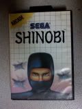
Prizes. We all want em. But what can you win if you're the lucky one picked? Lessee....how about...you move to the top of the heap to have your comic reviewed! That's cool, right? And also...one of my patented interviews for the site! Great, huh? I'll also throw in your banner for your site permanently displayed on Webcomic Asylum. That's a good one right there. One last thing. I rummaged through my collectibles and found something you might salivate for. An original 1988 copy of SHINOBI for the Sega Master System!! What hardcore gamer wouldn't want to get his mitts on this puppy? After dusting it off I have to say you will be amazed at how many more dates you get when flashing this trophy around. Just to whet your appetites here's the butt-kicking description for this crowd pleaser...
A NEW Sega arcade hit comes to life on the Sega System! You're Jo-Musashi, a mild-mannered martial arts instructor. but yuo have another job as well. When duty calls, you're a Master Ninja! YOUR MISSION: An evil terrorist network, the Ring of Five, has kidnapped the children of the world's leaders! You must get the hostages back...and defeat the Ring of Five!
They're waiting for you with gunmen, thugs, mongos and green ninjas. But you alone have the power of Ninja Magic! It's arcade-like action...only from Sega!
Okay, now that you've picked your jaws up off the floor, just remember the contest starts today, July 31st, and ends August 31st. Wait...you're still sitting there? Get your butts up and walk around in circles coming up with ideas! Can't wait to see what you come up with! Go to PW to get ad sizes, and send jpeg format entries with your name and website(if you don't have one just your name) to uncaringmachine@aol.com. Have fun!
Tuesday, July 29, 2008
Interview time!
Ah, as promised, here is the interview with Fitch and Spoon, creators of the uncompromisingly insane webcomic Thick Pie. Onward!
1. Thick Pie. That name sure sticks out. What exactly is Thick Pie and how does it pertain to the comic?
Fitch: Thick Pie is the totality of out sub-conscious thought and pop culture references. You know, it's thick.
SpooN: Wait... what? I thought we had been talking about going to the diner and that it would be good if they had some. Whatever.
2. Are these characters hopped up versions of yourselves? And have you really ever done any of these things?
SpooN: Weeeell, sorta... I like to think that these are the adventures we would have if we were more interesting.
Fitch: Filthy lies!!! We haven't done much, but we totally went on an adventure to Belize with Jonathan Taylor Thomas and Amanda Bynes that one time.
3. What tools of the trade do you use when creating Thick Pie?
Fitch: Voice recorder, notebook from the Beastie concert, pen from the autism class, the influence of the universe.
SpooN: iBook G4 and Flash. Most of the comic is created in Flash, tho there are some instances where a physical drawing is required. That and huge bags of 'inspiration'.
4. Any formal training or are you self taught at creating comics and art?
Fitch: Read some Scott McCloud books. The first episode of Pie was a conversation I wrote in my first notebook and handed to Spoon who went mad with panels. I soon learned how to trim down some of my wordage, where to try and time jokes, how to communicate to Spoon what I want to show. So, selftaughtish.
SpooN: Let's see... I've been into art for as long as I can remember, especially digital art. I've had a bit of formal schooling but most of it is self taught.... and I'm always learning! I've been comiking since early 2005 slowly self learning all of the tricks of the trade. I've also had a lot of help from people who've been in the biz for awhile. Whoever told you of the room full of monkeys and slave labor we have in the back of the building was a fool!
5. About how much time per day do you spend on the comic and how long does it take to make one strip?
SpooN: That all depends on the script.... and how 'addled' I am.... It can take anywhere between a couple hours (if it's a nice simple single panel) to a couple days... weather conditions and TV fodder play important roles in the time line of the comic as well.... I mean I'm not one to miss my stories...
Fitch: Daily work would be making sure to record any potentially strange ideas. After that it's develop them toward a script on the computer. Break conversation into panels. Bold important words. Write in panel descriptions, facial expressions, poses, F's teeshirt, location, title. Bang out a dozen in a day or two, sit on my ass the next three months.
6. What is one thing that you think has improved about your comic since it's beginning?
SpooN: Most deficiently the writing... I mean I could barely read it before without the aid of a dictionary and some Franklin style bi-focals.
Fitch: Oh weird I was gonna say the artwork, it still looks like a child chose the color pallet and everything mind you, but Christers have you seen the early ones?
7. What do you think about the current situation in Iraq?
SpooN: Yes. Yes I do.
Fitch: -sigh- We need to have decisive action taken but at least it's bringing energy to the forefront? 2012 fast approaches? Learntoswimandstockupontoiletpaperandbullets?
8. If you could do a crossover with any other webcomic, which would it be and why?
SpooN: That's a tough one.... I think personally it would be Wapsi Square. It's a really good read and I've always thought our characters would fit in well in that world.
Fitch: The ones that come to mind are PLUG *Bad Touch* PLUG or PLUG *The Smashing Adventures Of The Bottomleys* PLUG which I have good feelings about. wakingupdeadstudios.com
9. What is your favorite kind of pie, other than thick?
SpooN: Is beer a pie? I'd really like me some beer pie... Yeah, definitely beer pie.
Fitch: Beef pot pie. That's a joke of course, I just wanted to say pot pie. I would love someone to make me an unpoisoned/defiled key lime pie though. hinthint
10. One last question for you guys. Why should everyone try out a slice of Thick Pie?
SpooN: I think we have way too much fun making this. I mean sometimes I catch myself giggling uncontrollably. I mean how can we be legally having this much fun? Why not spread the madness?
Fitch: Someone must justify my humbly hidden hubris other than my moms. It mostly won't make you want to vomit in your mouth. It brings your ancestors back from the dead. Will add like, seven inches girth.
Well, another interview down the drain. Thanks to the guys over at Thick Pie , and thank you for reading!
Monday, July 28, 2008
The Floating Lightbulb!
Craving even MORE webcomic reviews, interviews, and news? Well, here's a site you might like: The Floating Lightbulb! If you like well written reviews and brain expanding interviews, trust me, you'll enjoy this site. Webcomics are an ever expanding medium, and we need more of these sites to get the little guys out there. Also on the site you'll find links to the authors very own webcomics and his wifes blog, Dog Toys And Dried Blood. Enjoy, and tell em Jack sent ya!
Friday, July 25, 2008
What's new...
Hey all, just dropping by for a little news. A brand new interview with the creators of Thick Pie is coming up soon, so get ready for some pretty creative and funny answers if I know those guys. Also, a new poll is up asking how many comic reviews I should put up on the site per week. How many would YOU like to see? And hey, how many of you have seen this behemoth The Dark Knight? What's this movie about anyway? Okay, back to my dark corner in my mountain cabin.....
Wednesday, July 16, 2008
Updating vs. Not......
Today I decided to go back and check every single comic I've reviewed from the beginning of this site and check which ones were still updating, and which had fallen by the wayside. Well, what did I find out by doing this? I found out that this is not something a good portion of people take seriously. I get that it's basically a hobby, and to really attempt to make a go of it professionally you have to put your all into it. With that said, out of fifty reviews, the tally is as follows: twenty four webcomics still updating; twenty six not. Wow. They all requested reviews of their "babies". It just shows that other things really can put a strain on your ability to continue a daily, weekly, or even monthly comic. It's no wonder that webcomics still aren't considered a serious medium. But, as I said earlier, it is still basically a hobby to most, and that includes me. I just didn't expect the numbers to be so close. And I ESPECIALLY didn't think that they number of comics NOT updating would be greater than the number of them still updating. A bit of a bummer, but I'll keep on reviewing, and hope that the number of comics that continue the fight increases with time. Onward!
Saturday, July 12, 2008
Review: Odd Fish....
I used to go fishing a lot when I was a kid. Loved yanking those cat fish outta the water, yessiree. Just something about the impending tug of the line, the excitement of you versus a little critter that can't possibly defend itself...urr...how about we get to the review? Nobby Nobody's(Phillip Blackman, for those not into cool net names) OddFish is a gag-style humor strip teaming with aquatic life, but focusing mainly on the misadventures of Lovecraft, an octopus with designs on destroying humanity, and a puffer fish named Howard. Updates? Wednesdays and Saturdays.
The ocean is rife with creatures big and small, far and wide, friendly and not so friendly...so you would think that it would be tough to handle the artistic chores of this world. Not so for Nobby. The "biro" art(which is explained as being the UK name for ballpoint pens. Neat!) is exceptional. I've never actually known a webcomic to be drawn in all ball point pens, unless it were some scribbly lined paper mess. This ain't no mess. I was wondering how he was able to achieve that soft blue look before I read the "about" page. It's a really neat and simple concept that gives ODD FISH a unique style all it's own.
Even without the biro look, Phillip has an amazing eye for detail that left me more than a bit jealous. The enormous level of cross hatching must take him forever, and every sea creature is lovingly hand drawn, right down to each individual suction cup on the tentacle of an octopus. Great work.
I know what you're thinking. "Yeah yeah, pile on the praise for the art. I bet the writing sucks." Well buddy, I've got news for you. The writing is just as good as the art! What, you say? Here's why. Clever jokes. That's right. From "internet prawnography rocks!" to "giving my mussels a workout!" I got the jokes and got a kick out of them at the same time. While a majority of them come from "ocean" humor, and it borders on overkill with a side of cheesiness, it never quite walks the plank in my opinion. I mean hey, what would be the "porpoise" of an underwater strip if you couldn't rely on the humor that comes from it? Heh, I couldn't help myself with that one...
The writer clearly shows an indepth knowledge of the creatures he incorporates into his comic. The amount of detail shown and facts used would make Jacques Cousteau proud, if he were still alive and kickin'. I wonder if Phillip has a ton of books on sea creatures. Definitely good to see someone with a love for what he does.
From the review, I guess you can pretty much tell I loved this comic. I don't have anything overtly negative to say because OddFish ranks right up there with the best of what webcomics have to offer. Solid, clever writing and beautiful hand drawn artwork. You would not go wrong bookmarking this one and making it a must read on your list. "Immerse" yourself in OddFish!
I give OddFish...
TEN CHIMPS!!!!!!!
Subscribe to:
Posts (Atom)