Wednesday, March 28, 2007
Vacation time!!!!!
I'm heading to Tennessee tomorrow so todays review will be the last one until most likely Sunday April 1st. Until then check out GothyMcgee which updates daily and please return on the 1st for more reviews. Leave comments if so inclined and thanks for reading! Seeya!-Jack
Quarter Four....
Quarter Four is a comic by Saadat Bari about four college roommates named Bry, Dwak, Saadji and Jay and their daily struggles with everything from girls to hairstyles gone wrong. The archive is 48 pages long and it updates on Mondays.
Artwise this comic is very well done. The artist does a good job with a wide range of facial expressions making for a very human feel missing from a lot of webcomics. Also backgrounds are plentiful, giving you a nice sense of the environment they live in. The art only gets better with each comic, from the beginning with it's more rigid sharp lines to the latest comics with their rounded softer look. I liked the coloring and shading as well, which lends a very professional look to Quarter Four.
The humor has a nice subtlety to it, almost as if he doesn't wish to beat us over the head with bad jokes and obvious situational comedy. It reminds me of independent films I've seen that don't have huge payoffs, but sort of just calmly play out and continue offscreen long after the movie ends. The only thing I can say negative is that it felt a bit dull at times, but this isn't an action comic or even a wacky roommates one. Don't get me wrong though, I got quite a few smiles out of my stroll through the archives.
In closing I would have to say that I enjoyed Quarter Four for it's quality art and kind tone. I recommend it to anyone looking for something a little off the beaten path. Of course, it won't be everyones cup of tea, or coffee, or beverage of choice, but hey, what is?
This comic is...Recommended
Tuesday, March 27, 2007
Packet of Noobz......
I've decided that you don't need to have a set number of comics in your archives for me to review your comic if I'm asked to do so. The reason being that some people want an opinion no matter how in the early stages their comic is. So, without further ado, I shall continue....
Some people say that there are too many "gamer roommates" comics out there, but I disagree. What if you said that there should only be one or two buddy action movies? Then a third of the movies in the pipeline would have to be scrapped! But to be fair, not all buddy action movies are good. Actually, most are craptastic. But there are those gems that pop up from time to time, like, say.....Lethal Weapon. Packet of Noobz is no Lethal Weapon. I would say judging from the four comics up so far it's closer to a Weekend at Bernie's. The comic follows the sitting-on-the-couch exploits of a couple of gamers who apparently hate the Playstation 3 and curse more than the most hardened sailor. But wait, there's more....
The art is, well....cut and paste at it's finest. When comic creators use the cut and paste method of art the comic has to rely on the writing to entice viewers. That's where Packet of Noobz needs work. So far the jokes are just lots of cursing and the characters wanting to get laid. Also it's sometimes hard to tell which word bubble to read first because they are too close together. And in just four comics I found six errors in spelling. Spell check would fix that problem in no time. On the plus side the character designs and a hint of the writing remind me of South Park, which is always good.
Taking into account that this is a review based on only four comics, Packet of Noobz would benefit from more time being spent on writing better material and possibly moving the characters off the couch for a time. Personally I like gamer comics and would like to see this one improve. I'll be checking on it in the future to see what develops....
This comic is...Not Recommended
Monday, March 26, 2007
Zoology........
Zoology, created by Nathan Birch, centers around a zoo filled with the usual assortment of critters held in captivity for our amusement. The difference being that we get to see what life is like behind the cages as characters the likes of Ernest P. Ape, Angsty the Octopus and Detective Chomps grace us with their adventures. The animals get equal treatment when it comes to being featured in the comic, as well as do the keepers of the zoo.
Artwise the comic is very well drawn and the lettering fits the comic perfectly. Backgrounds are used sparsely but it doesn't really have any negative impact. I also prefer that it isn't in color, because this comic looks like it would fit in very well in the funny pages of your favorite newspapers(maybe it could knock Garfield outta there). Of course, it's occasional use to enhance a strip works wonders. Color definitely has it's place here. Perhaps a Sunday color comic? Just a thought........
Writing jokes can sometimes be tricky, but on this point most of the comics hit their mark, with only a few not following through. I like the fact that he can do a sentimental story and then follow it with Chomps eating everything in his path. Variety is welcome! A minor quip would be that I found more than a couple of spelling errors, but with such a large archive that should probably be expected. It happens to the best of us, doesn't it? A few more visits from the outside world would be welcome as well. I don't know if it's just me but I would like to see more visitors and how they react to the zoo creatures. As a whole though the writing is high quality and on a level with the top comics out there, in my opinion.
I recommend Zoology because it's a very well written and nicely drawn comic that deserves success. I could even see an animated series for this one. Imagine Ernest P. Ape taking calls on your television, voiced by Kelsey Grammar! Okay okay, I'm getting ahead of myself. Go to the link and check out Zoology for yourself. I think you'll enjoy it.
This comic is...Highly Recommended
Sunday, March 25, 2007
The Nineteenth Century Industrialist.....
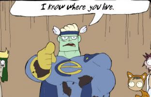
The Nineteenth-Century Industrialist is a humor comic that centers around a character named Hiram Thorpe, a "Nineteenth-Century Industrialist" as the title suggests. He is somehow living in our time, which is not explained. His driving motivation is, well, making money. Here you'll find the main source of jokes. Also, he tends to let loose this maniacal cackle whenever he rips what he considers a funny. The guy is obviously insane. But you probably would be too after years of corporate greed and making your living off of the backs of hard working regular joes like Soot and Grimey. Other characters who make appearances range from a time traveling Karl Marx to a psychotic superhero named Colonel Earth who reminds me of a finally lost his marbles Captain Planet.
Art-wise, this comic has a lot going for it. Renee Katz has a great style that reminds me of classic Bugs Bunny cartoons mixed with a hint of chibi-ness. The coloring is also perfect for the comic with its subdued tones not screaming at you and making it hard to look at for too long. The only problems I had visually were that the lettering font used can sometimes be hard to read. The font itself fits the comic well, it could just be a bit darker. Also I could have done with a few more backgrounds; but this is a minor complaint.
The writing is pretty well done, but sometimes I didn't see the joke. In one for instance, Hiram attacks these two creatures playing in the sun and says he's going to eat them. He then proceeds to and one says "not again!". I don't get it. Are they an endangered species or is he just insanely hungry? Beats me. But, others work well, as in the Pope showing up and demanding tithes. I particularly liked those. And I sure don't like Colonel Earth knowing where I live.
I recommend this comic for anyone with an offbeat sense of humor who can handle wanton violence and isn't offended easily. A few minor quips don't keep this comic from being a good read. And at only 20 comics in, it has nowhere to go but up! I'll be watching this one. And that, my friends, is MY OPINION.
This comic is...Recommended
Saturday, March 24, 2007
Heroes Of Audioland....
Okay, my first review. This comic, created by Michael Dyer, is about AudioMan, AudioBear, and AudioBabe and their heroic exploits in a place called Audioland. These three heroes have been handpicked to protect Audioland from outside threats, such as Neo-Nazis and Da Bowlin' Ball Team, some of the craziest supervillains I've ever seen.
Now, I like the heroes because of their simple designs and costumes. I mean, how can you go wrong with a bear in tights and a man wearing headphones while fighting crime? Also, there is an origin story to AudioLand, and the heroes powers are even explained, which are signs of good writing. On the other hand, the art seems rushed and a bit sketchy, which the artist even attests to under each comic. And from reading the comments he leaves under the comics, he tells us that the first book was drawn up in 24 hours and the second in a few days. I don't understand the need to let us know that this comic was rushed or your pens ran out on this comic so you switched from black to blue mid-page, but it's still sometimes interesting to read why this and that happened to each particular comic. The art does improve after Book 1 though, with the heroes even getting new costume designs and AudioBabe getting a new mission, and the comic lends itself better to color, which he tries out for a time.
All in all, it's not bad, but has a long way to go before it's a recommended read. Anyway, I'm not sure if this is the comic for you, but if you like superhero comics, you should at least give it a look and make your own decision on it, in my OPINION.
This comic is...Indifferent
Friday, March 23, 2007
Subscribe to:
Posts (Atom)